"Overall, using Tuva greatly sped up the process of creating graphs. Instead of using that time to "make" a graph [in Google] they were able to go more in depth with analyzing what the graphs says about their results." - Toni B., Science Teacher
Spreadsheet applications such as Microsoft Excel and Google sheets are useful for organizing data, but they are not designed for learning to visually explore data in different ways quickly and with a statistical mindset.
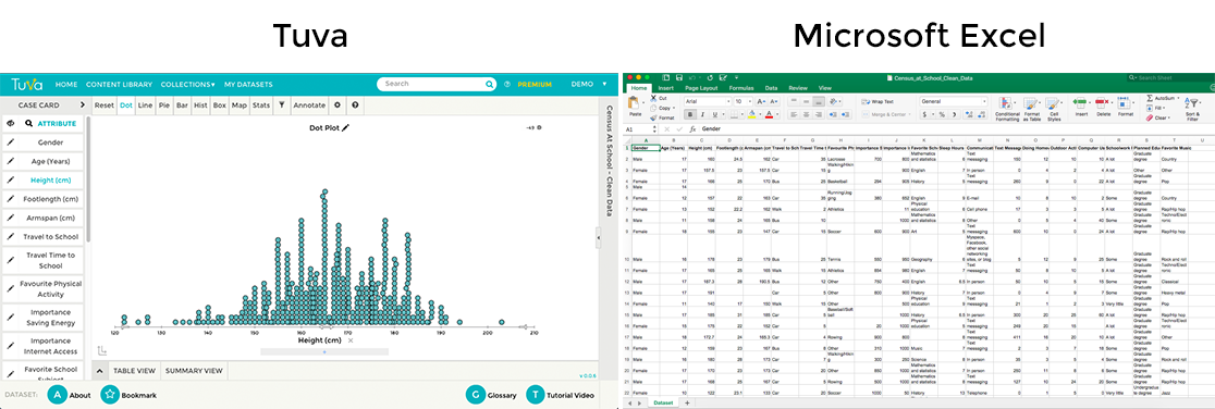
Comparing Tuva Tools and Microsoft Excel for teaching and learning data, graphing, modeling, and statistics.
|
Tuva |
Spreadsheet Software (Microsoft Excel, Google Sheets) |
|
Students can quickly and intuitively explore data by simply dragging and dropping data attributes to either axis. |
Graphing in spreadsheets involves numerous technical steps, range selections, and clicks. |
|
Students can transition to different ways of looking at data quickly without getting bogged down in multiple technical maneuvers between graph and spreadsheet; they can keep focused on the data. |
Technical maneuvers consumes much time when graphing in spreadsheets. |
|
Students can develop an aggregate view of data by visualizing how data are distributed along a number line using dot plots, box plots, or histograms. They can use exploratory tools such as dividers, movable reference lines, and a sketch tool to help them reason about group properties of data and make sense of it in a real-world context. |
Distributions of data are not easily made in spreadsheet applications. |
|
Students can quickly filter data to look only at selected categories or sub-ranges of the data, or to see how including or excluding parts of the data affects statistical measures. |
Filtering data in spreadsheets often requires reorganizing the spreadsheet and re-creating a graph from scratch. |
|
Students can visually compare graphs using summary statistics (mean, median, linear regression, standard deviation, mode) intuitively and with minimal clicking. |
|
|
Students can visually (and quantitatively) compare variability between groups and reason about what variability means in terms of predictability and uncertainty in claims. |
Most spreadsheet program son’t easily make dot plots or box plots, so discussion of variability and its implications for uncertainty in claims are often missing from students’ reasoning about data. |
|
Students can see the unique combination of attributes of any individual case (sample), and how a case relates to to the rest of the group, using Tuva’s interactive display that represents data in several ways at once. |